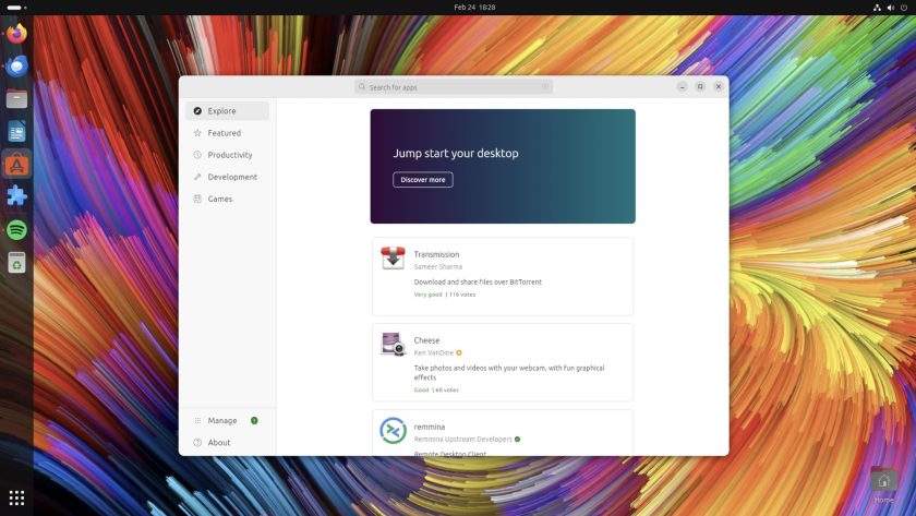
About a week ago I noticed that the default icon for App Center (the Flutter-based software store-front that replaced Ubuntu Software in 23.10) had changed — and not for the better!
At first I assumed its appearance wasn’t intentional but a snafu or screw up caused by me (I was playing around with display scaling options when the icon in the dock first changed).
But it wasn’t related to me truing out different fractional scaling options.
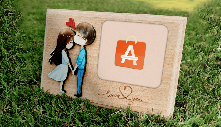
As App Center is a snap (snap-store ) it gets updated in automatically in the background. An update rolled out that included a new icon, which you can see below. It still uses the shopping bag motif but is 2D, one colour, and has transparent elements, more akin to a symbolic icon than a proper one:

Design is subjective. I know that. You know that. What looks good to me might look awful to you, and vice versa. I don’t claim to be a master of design (have you seen some of my article thumbnails?), nor an a-grade arbitrator of taste.
Plus, Ubuntu has pushed out individual icon changes in the past (though not all of those revamps have been universally… I’ll choose to use the word “understood” 😅).
Anyway, icons are just icons: they don’t impact functionality or what you can do with Ubuntu (though on some level a bad icon can make it harder to discern what you can do hence why design is an entire industry and bad design can tank a product).

And yet this ‘new’ App Center icon wa bugging me! It’s totally unlike the rest of the Yaru icon set. I wondered if its gratuitous odd-ness was a harbinger of an icon revamp in the pipeline or, if it wasn’t, whether anyone else found the glyph gross enough to file a bug about it.
I didn’t get as far as gawking at bug reports, though.
Github project pages display the most recent commit near the top of the main page. When I visited the App Center Github page I didn’t have to click on a tab or search for what I was looking for as the words “icon fix” were staring right at me.
Can’t lie: I did sigh in relief! ❤️

It turns out that update to App Center — possibly made late last year though as the ‘new’ icon only recently appeared to me I can’t commit (😉) to saying that — included a hardcoded icon (the one you see above) to ensure those using non-Yaru icon packs see an icon at all.
However, and I don’t know how or why, the hardcoded flat icon ended up becoming the default icon in Ubuntu, which is why it suddenly appeared in the Ubuntu Dock when the update (belatedly, it seems) hit my 23.10 install.
So a “fix” has been committed. It restores the correct icon. Expect to see it blink into being the next time the app updates in the background (which in my case will be 2 months after everyone else).
Visual paper cuts, bad icons, or whatever you might call this — *gestures with hands at essay above* — aren’t devastating in impact. But they’re a bit slapdash if (as it sounds) unintended user-facing changes are being pushed out idly.
Still, I can’t wait to have the 2.5D shopping bag icon back, and full Ubuntu-y Yaru-y consistency restored on my desktop.


