Audacity is an open source heavyweight but the look of the app is very …Let’s describe it as “utilitarian”.
Now don’t get me wrong; utilitarian is not a bad thing. Audacity is famed for its powerful, professional-grade feature set rather than its looks — and rightly so. Constantly changing interfaces based on whatever the leading design whim of the day can lead to an endless churn of repetitive releases that favour form above function.
And while I’m rolling out the Fs familiarity is also deeply important too. This software is at the heart of audio editing workflows on multiple different operating systems and platforms. It can’t make major visual changes on a whim (and even if it did it’d probably still end up not looking great somewhere or to someone).
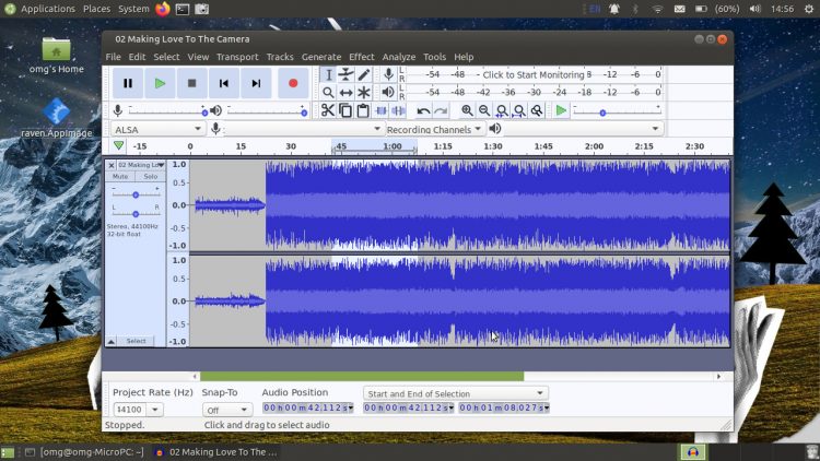
Reams of documentation, tutorials, and how to content are made on the assumption that you’re using Audacity as it came, with everything in the correct place, as per this screenshot:

But — and now we get to the meat in this content sandwich — you can choose to change the way Audacity looks.
If you don’t dig the default look — which, in contrast with other editing apps, is light by default — you can change it. Audacity supports theming. It even comes a bunch of built-in themes, including a dark option to get you started.
Now, I should point out here that I don’t actually use Audacity (or any audio editing software, as those who endure my YouTube videos will attest) regularly. As such, I can’t reel off a bunch of tweaks that I guarantee will improve, enhance, or otherwise revolutionise your audio editing experience.
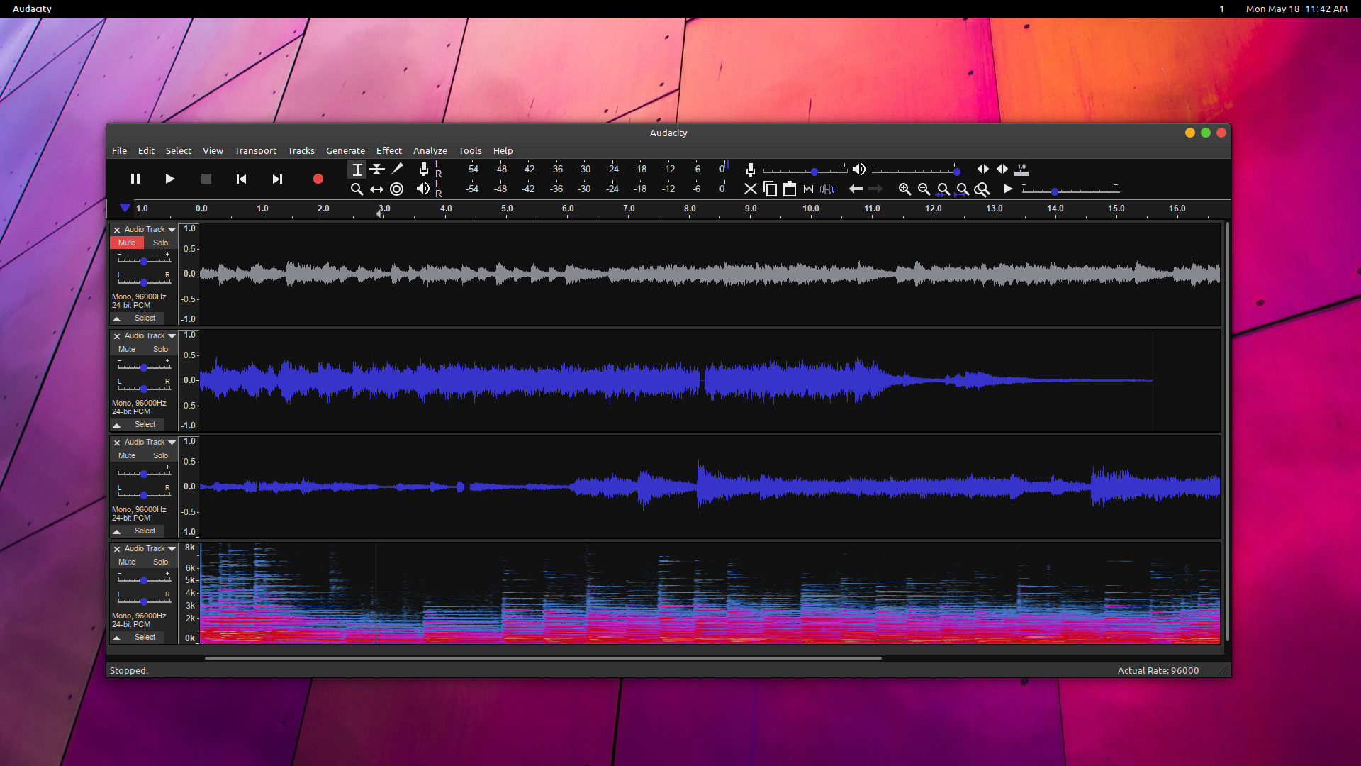
But I can forward on the slick set-up shown off by JustPerfection in the comments of the Audacity 2.4.0 release article (and now visible at the top of the post). I think it looks fantastic. If I was using this app often I’d certainly want something a little less intense than the default.
Want to achieve the same look yourself? You can by downloading the ‘Audacity Clean Dark Theme’ by ~Podel1 from DeviantArt. This theme ticks several of my boxes:
- Dark ✔
- Colourful ✔
- Modern ✔
Even better, the theme comes in a range of different colours (though sadly not orange) including blue, cyan, and purple.
To recreate JustPerfection’s look on your system (assuming you already have Audacity installed) follow these steps:
- Download the Audacity Clean Dark Theme pack
- Extract the
.zip - Copy
ImageCache.pngfrom the named colour folder you want - Paste file into
~.audacity-data/Theme(if the directory doesn’t exist, create it) - Open Audacity > Preferences > Interface
- Select ‘Custom’ theme option
That’s it. Your Audacity now boasts a sleek dark look that your eyes will thank you for!
For the complete look JustPerfection recommends hiding (unchecking) the device, selection and spectral selection toolbars using the View > Toolbars menu.
If you tire of the new look just follow the steps above in reverse, selecting the “light” or “classic” theme instead of “custom” to get the app looking like its old self again.
h/t/ JustPerfection
How To
Themes
audacity
deviantart


