PowerPoint is a useful program to help you create slides for a presentation and even turn them into a video. It has aged well and is still one of the most popular choices for educators, in-house business presentations and home theatre applications.
You can add graphics, text, and multimedia to enhance
the appearance and make your presentations more engaging. The list of rich
media, including music and video continues to grow.
Along with those features is the ever-expanding
variety of templates. Even so, not every template has all that you want or
need. Some editing is still required from time to time. The good news is that
those templates, purchased or free, can usually be modified and edited by you.
Contents
Edit Or Modify a PowerPoint Template
When
it comes to Powerpoint templates you can:
- Start from scratch with a
blank presentation and use it as a one-off or create a custom template - Use one of the themes
provided from the program or downloaded for free - Purchase templates from
various sources
Learning
how to edit a presentation is a valuable tool to have in your kit. Many
tutorials suggest using the Slide Master
view. However, Slide Master provides blank layouts. It is not a way to edit an
existing template.
Let’s
say you just purchased a bundle of templates because they look impressive and
you want to use them for your business. However, the templates are niche-based,
and your business provides online services such as website design.
For
example, maybe you like the layout and built-in animations of a real estate
Powerpoint template. Does that mean you can’t use it? No, you can customize it
for your business by swapping out the images with ones that are more relevant
to your industry.
There
are many ways to edit a Powerpoint presentation. For the purposes of this
tutorial, we are going to outline the steps to turn a real estate template into
one for a website design company.
Start With The Cover Slide
Below
is the first slide in a purchased real estate Powerpoint presentation.

The first thing you will want to do is to replace the
house image with an image of a website. There are two different ways to do
this.
Right-Click On An Image To Change It
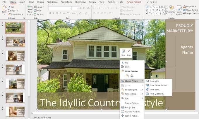
Some templates will allow you to swap out the picture simply by right-clicking on it and choosing Change picture. Then select the source of your new image (File, Online Sources, Icons, Clipboard).
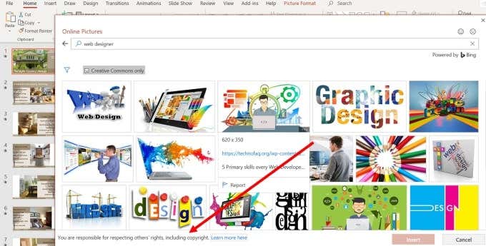
I prefer to use image sites that I know are free and
not subject to any copyright laws. As you can see in the image below, when you
select From Online Source, you are
taken to a screen where you can choose pictures under Creative Commons.
However,
there is also a disclaimer on the bottom of the pop-up that says: You are responsible for respecting others’
rights, including copyright.
To be safer legally, use the From a file option and choose an image from a free stock photo website.
Use The Selection Panel To Change Images
Templates
that have more complicated animations and transitions will require a different
method to change the images.
Start by making sure you are on the Home tab in the top navigation bar.
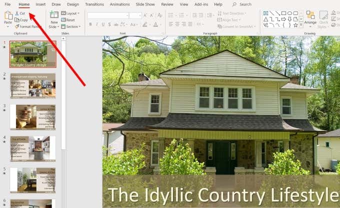
Now you want to look for and click the Select drop-down menu on the right slide of the top navigation. Choose Selection pane.
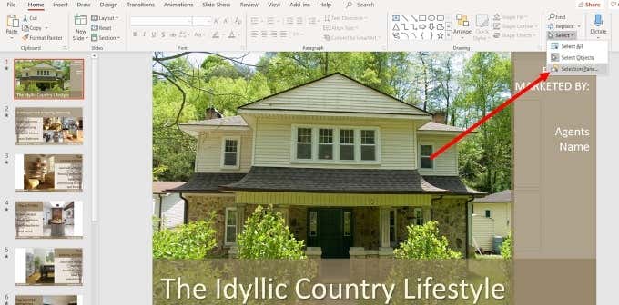
This will open a new tab that shows you all the elements on the slide and gives you the ability to “show” or “hide” them.
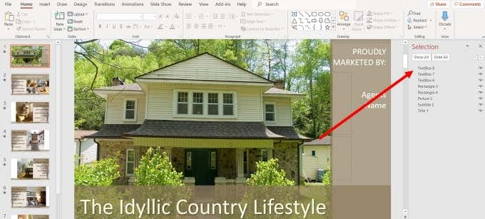
Your goal in this step is to isolate the image from
any other elements on the slide so that you can change it.
Click on Hide All so that you see a blank white screen. The number of elements you will see in the selection panel will depend upon the complexity of the slide.
In
this example, it is easy to identify which element is the image as there is
only one picture. If your slide has many photos, you will want to click on the
dash (-) next to the name of each picture element to find the one you want to
change.
Click them on and off until you find the right one.
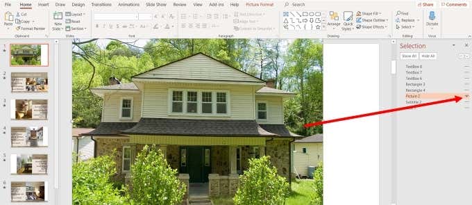
Make sure that once you find the right picture, it is the only element that is showing. By hiding the other items, you can isolate the image to change it.
At this point, you can follow the same instructions above by right-clicking on the image and selecting Change Picture.
Change Font & Shape
Colors
You
can also change the font colors and type, as well as the transparency and color
of the shapes.
If
you choose an image that uses the same color scheme as the template, you will
probably only need to do minimal changes, if any. But if you find a picture you
want to use that doesn’t match the color scheme, don’t worry. It’s easy to
change.
The
image below shows the cover slide with a website image that replaced the
picture of the home.
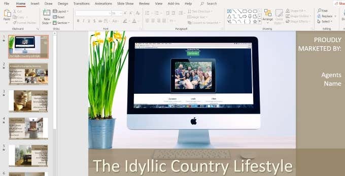
It looks out of place from a color perspective. So,
let’s change the colors to match our new image for a more congruent look.
Change The Color Of The Shapes
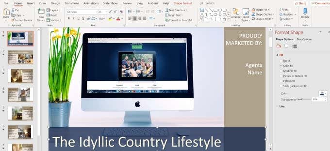
Right-click with your cursor on the background shape that contains the title and select Format Shape.
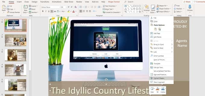
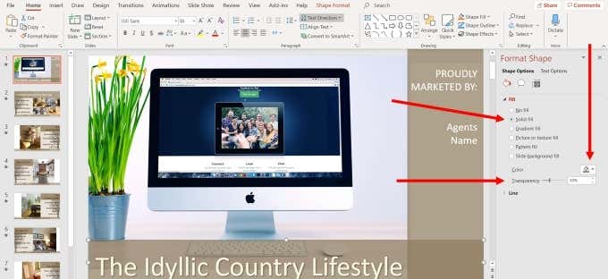
This process will open a side panel where you can see that the bottom bar is filled with a solid color with 30% transparency. You can also see the color that is used.
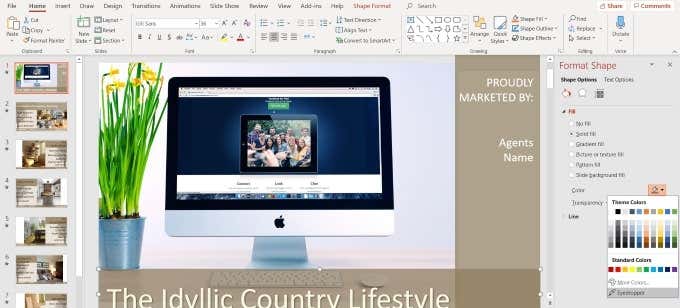
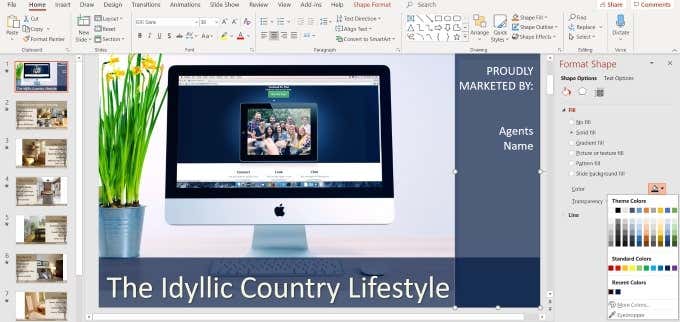
Let’s select a color that blends better with our new image. Click the dropdown arrow next to Color and choose the Eyedropper option. You can also select any theme, standard, or custom colors. But if you want to match the colors in the image, using the Eyedropper works best.
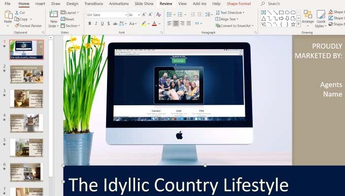
Move your cursor to any part of the image that is the color you want to use and click return. You will now see that the bottom bar is the color you chose using the Eyedropper.
Now, remember that the original slide had a 30% transparency effect. This is removed when you change the color. If you want to use that with your new color, right-click the bottom bar, select Format and put the Transparency level back to 30%.
Follow the same procedures as above to change the right color column to the same color. You will notice that now there is an additional section called Recent Color to make it even easier for you to use the same color you used before.
Edit Text
You can change the color, font, size, and location of any text in your template. Start by highlighting the text and looking at the top navigation section that refers to what you can do with text.
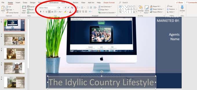
With the text highlighted, you can make several edits,
including:
- Type
- Size
- Color
- Style (bold, italic,
underlined, shadowed)
If
you are not sure what any of the options mean, hover your mouse over it to see
a description. Of course, you will want to replace what the text says to match
your business.
To move the location of the text, put your mouse over one of the dots you see in the highlighted section until your cursor turns into a vertical arrow.
Then use the arrows on your keyboard to move the text up, down, right, or left.
In
this sample, the white text looks good with the image and color scheme.
However, it could use a few tweaks to the location and style.
See
the new slide below and how we transformed it from the original slide by
customizing it while keeping the same basic design, animations, and transitions
as the template.

The benefit of editing and customizing pre-made
templates is that you can benefit from the design skills, animations, and
transitions of professional Powerpoint creators.
There
is no need to avoid a template that is geared towards an industry or niche that
isn’t yours. By following the instructions above, you can have the best of both
worlds.


