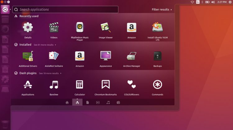
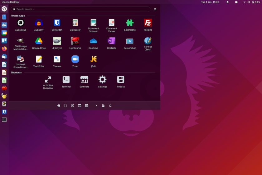
Want to make GNOME Shell look like the Unity desktop? If you do, then this guide is for you.
Just don’t thank me for what follows. A reader called Alwyn sent the whole run-through to me via the Tip Form, complete with screenshots. They said I could publish it if I find it interesting (which surprise: I do).
But I’m uneasy publishing anything not written — typo’d? — by me. You may notice I’m the only regular author around here). There are a number of reasons for this like copyright, vetting, plagiarism, etc but the only one that really matters here is: I can’t afford to pay for contributions.
However, since Alwyn took the time to create a well-written and thoroughly-researched guide with me, and I know the subject matter will appeal to many of you, I didn’t want to ignore it so I’m sharing it as a .PDF. That way I don’t get any glory for writing something I didn’t, and Alwyn’s post can be read and shared properly.
So, if you’re ready to mould modern GNOME into the visage of Ubuntu’s desktop past, read on!
Why Make GNOME Look Like Unity?

Before we begin, a little history lesson.
Ubuntu’s Unity desktop was divisive from the off. It got a severely negative reception for its first couple of releases. Aside from missing features, part of disapproval was down to the fact that people were happy with the traditional GNOME 2-based desktop Ubuntu was using (this was pre-GNOME Shell, remember). It “just worked”. Being shunted to use something so alien by comparison — a left-hand launcher?! a dash?! window buttons in the top bar?! — was something of a culture shock.
Fast forward six years. In 2017, when Canonical announced the end of the Unity desktop and a switch back to GNOME, something strange happened: people were upset. Turns out that the ‘alien’ UX everyone hated …worked well, and people weren’t happy to be losing it.
PSA: Unity isn’t dead, of course.
The folks at Ubports continue to work at making Unity 8 a reality; there is effort to preserve the Unity 7 experience; and a community team hope to build a next generation Unity desktop. Also, you can install Unity 7 on a modern Ubuntu release but it’s not quite the 1:1 experience it once was.
Hence Alwyn’s guide.
It’s all done using GNOME extensions

Now, be prepared: making GNOME Shell work more like the Unity desktop is a bit more involved than just putting a dock to the left-hand side of the screen. Alwyn’s guide — PDF linked below — walks through the whole process, and has plenty of screenshots to show the exact settings they used to effect a similar look and feel.
The core experience is made up of three GNOME extensions:
- Dash to Dock
- Arc Menu
- Unite
Yes, the first step in the guide is to replace the Ubuntu Dock with Dash to Dock GNOME extension. I know they’re technically the same thing, but Dash to Dock exposes more settings through a GUI making it easier to configure than the Ubuntu Dock (whose advanced settings are hidden in dconf.
Talking of… Be aware that any settings you tweak in Dash to Dock will overwrite the same settings for the Ubuntu Dock. To “undo” these changes at a later date you will need to reset the Ubuntu desktop via dconf.
With the dock in place you can move on tweaking Arc Menu to provide a Unity-esque Dash, and use the Unite extension to tweak some other aspects of the desktop (e.g., indicators, window panel controls, etc) to get them more akin to how Unity had them.
There are a few things that could make the experience even ‘truer’ for me like adding a trash can to the bottom of the dock, using a GNOME clock editing extension to tweak the time format, and using an extension to split out GNOME’s unified Status Menu into separate “indicators”.
But in all, a great effort — if you’ve got nothing else to do this weekend go follow this guide and indulge your nostalgia.
Big thanks to Alwyn for taking the time to write such a thorough and well-illustrated guide (and I hope you don’t mind me presenting/sharing it this way).
Download
How To
Eye Candy
GNOME Extensions
Readers’ Tips
Unity


