When Linux Mint 21.2 is released this June it’ll come with a selection of new visual “styles” for users to choose from.
Announcing this visual buff in its latest monthly update, Mint says the feature will simplify the Cinnamon desktop’s extensive customisation capabilities whilst still satisfying those looking to fine-tune the way their desktop looks and feels.
“A style has up to three modes: mixed, dark and light. Each of these modes can contain color “variants”. A variant is a combination of themes which work well together,” Mint says of its new feature.
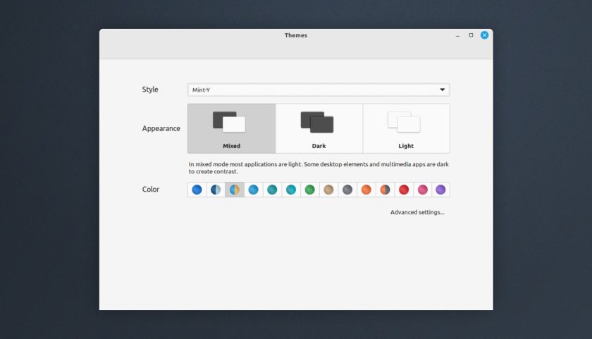
Effectively, Linux MInt’s new “Styles” are “one-click” combinations of UI elements that work well together. Instead of users needing to individually select matching components (e.g., gtk theme, icon theme, shell theme, etc) in different pickers they simply select the overarching style instead.

In Linux Mint 21.2 a user first selects a style (e.g., “Mint-Y”, “Adwaita”, “Yaru” – these are just examples), then picks a mode (mixed, light, or dark), and then, assuming the theme supports it, a colour variant/accent from the options listed.
Simple, faff-free theming — but fans of the current way of doing things needn’t fear this change.
Whenever Linux Mint “simplifies” something they retain the ability to do things “the old way”. That’s the case here. Anyone looking to fine-tune themes further, or mix-and-match components from different themes, icons packs, etc can do so by clicking on the “Advanced settings” link.
Styles are not the only visual change planned for Linux Mint 21.2 ‘Victoria’. Following less-than-stellar feedback on its yellow folder icons, Mint will switch to a simpler folder motif and new ‘two-tone’ looks. A more curated choice of accent colour will be provided as Mint reasons some colours just don’t work well.
In all, some welcome improvements that don’t rock the boat but do make it a tad nicer to look at!


