Like Windows 7 was to Windows XP (see our previous post on the differences between Windows XP and 7), Windows 8 is a “completely re-imagined” version of Windows from start to finish.
It has been rewritten so that it can run not only on desktops and laptops, but also on tablet PCs in a much more intuitive way than before. We previously wrote how Windows 7 would be very different from Windows XP and could take some time for new users to become acclimated.
Well, Windows 8 is an even bigger change. For most people, the change was too big of a shock. The removal of the Start button caused too much criticism and Microsoft finally relented and added it back in Windows 10.
Windows 10 is not a huge jump from Windows 8 under the hood, so that’s why I’m comparing both Windows 8 and 10 to Windows 7.
Contents
- 1 1. No Start Button – Metro UI
- 2 2. Simpler Task Manager
- 3 3. Improvements to Copy, Move, Rename and Delete
- 4 4. The New Windows Explorer
- 5 5. Fast Startup Mode
- 6 6. Plug-in Free Browsing
- 7 7. Reengineered Boot Experience
- 8 8. Sign in using Microsoft Account
- 9 9. Refresh/Reset Your PC
- 10 10. Scaling for Different Screen Sizes
1. No Start Button – Metro UI

Never liked the Start Button? Well, it’s gone in Windows 8 by default. It’s now replaced by the Metro UI. Yes, Microsoft has said there will be a way to revert back to the traditional desktop we are all used to (thank god), but by default it’ll be set to the new UI interface.
I’ve played around with Windows 8 on a few test machines and I have to say that even though I think it’s a great interface for a tablet, I was not at all excited about using it with a mouse and keyboard. It looks a little nicer, but that’s about it. And clicking at the bottom left and not getting my typical start menu pop up was just too much change, even for me.
Obviously, this was added back in Windows 10, though the Start Menu was upgraded to include those new Windows apps. Also, the Metro apps phrase has been replaced with the term Universal Windows Platform apps.
2. Simpler Task Manager
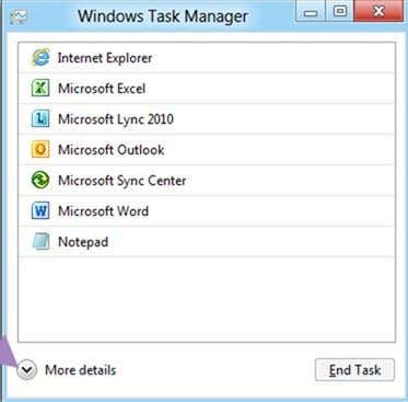
Ever noticed what tabs you actually used in Task Manger up till now? Probably just Applications and Processes. That’s about all I ever use and normally just to kill off some processor hungry rouge program. What you see above is the new Task Manager!
Yeah, that’s it. Just a list of apps running that you can kill with one click. What about processes you ask? Well, click on More Details, and you get a nicely split list of applications and background processes along with a heat map of CPU and memory usage.
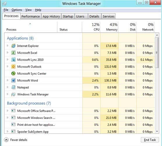
Pretty nice actually! That’s one change I am looking forward too. The current task manager was too detailed and overly complicated for the average user. This one makes it a breeze for anyone to use.
3. Improvements to Copy, Move, Rename and Delete
Yes, this may sound trivial, but if you really think about it, you probably move, delete, rename or copy a file/folder several times a day, if not more. These four basic operations have pretty much been the same for years and through all versions of Windows. In Windows 8/10, they get vastly improved!
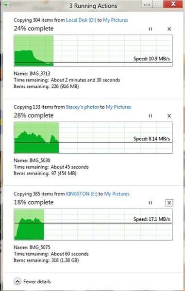
Firstly, when you copy stuff around, especially when you perform multiple copy operations, all of the info is consolidated into one dialog. No more doing 10 copies and having 10 different windows pop up. Now it looks like this:
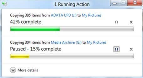
What you’ll also notice is the new pause feature. Finally, you can pause a copy operation in the middle of it! Yay! What’s really cool, though, is if you click More Details, you can see the speed of the data transfer, the trend and the amount of data left in the transfer.
4. The New Windows Explorer
Say hello to the ribbon interface! You’ve probably already been introduced to it in Office 2007 and Office 2010 and now it makes its way into Windows itself. Love it or hate it, it’s there as a permanent fixture. Here’s what the new UI will look like:
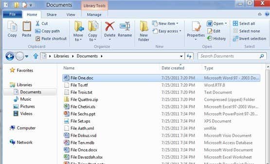
What do you think about this change? Like it or not? Like I said before, Windows 8/10 has been completely reimagined and you can clearly see that with all the major differences.
5. Fast Startup Mode
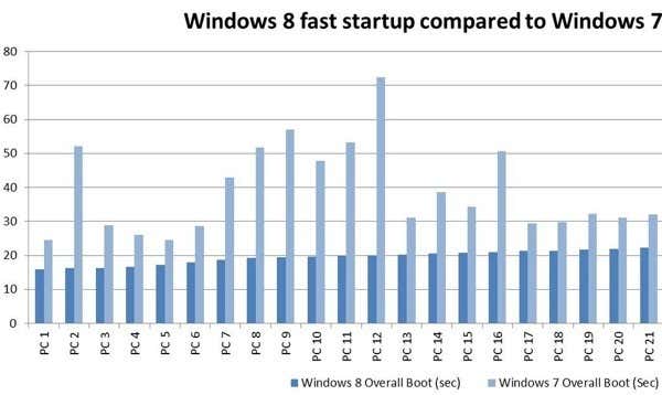
Boot times have always been an issue with Windows and they have tried their best to fix that with new power states like hibernation and sleep. Unfortunately, those have their own set of problems. In Windows 8/10, there is a new fast startup mode (probably going to be called something else later on), which is a combination of a cold boot plus hibernation.
Basically, this will be like “restarting” your PC without actually fully restarting it. You’ll still get a fresh user session with everything closed, etc like you just restarted Windows, but it’ll take significantly less time.
6. Plug-in Free Browsing
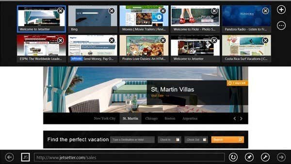
Not only does IE 11 significantly change the UI, it also changes the way you will be browsing. IE 11 is favoring HTML 5 over the traditional plug-in architecture and will run by default with no plugins.
If you need to use something like Adobe Flash for a site, you can switch to a “desktop” view, but for the most part, they are phasing plugin support out. WOW! That is huge. And pretty bad news for Adobe Flash.
Even though Apple doesn’t support Flash on their devices, Microsoft also moving in that direction is a major paradigm shift for the entire Internet.
In Windows 10, IE has been replaced with Microsoft Edge, a new standards-adopting browser from Microsoft that is very good. If you live in the Microsoft ecosystem, then using Edge is actually better than Chrome and Firefox. However, since I use Google for pretty much everything else, Chrome still is my default browser.
7. Reengineered Boot Experience
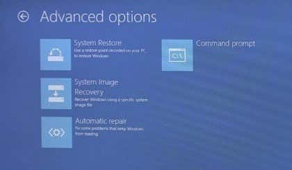
Haven’t we all gotten sick of the same tired list of “Safe Mode”, “Safe Mode with Networking”, etc., etc. when booting Windows with advanced options. It still looks a DOS command prompt, even in Windows 7. With Windows 8/10, that all changes.
The boot experience is now very pretty and reminds me of setting up my iPhone when I upgraded it to iOS 5. You get nice screens to help you join a wireless network, pick your settings, etc.
8. Sign in using Microsoft Account
With Windows 8/10, you can now sign into your PC using your online Microsoft account. That’s right, Windows 8/10 is moving to the cloud (a little).
With OneDrive integration also included in Windows 8/10, you can sign in using Microsoft credentials and have your files, settings, apps, etc. stored in the cloud. You can log into another Windows 8/10 machine and all of that will follow you automatically.
It’ll keep track of all your favorites in IE/Edge, your desktop wallpaper, and lots more. You can buy extra storage and store your files on OneDrive and access them online or on your mobile device including the iPad, iPhone, and Android devices.
9. Refresh/Reset Your PC
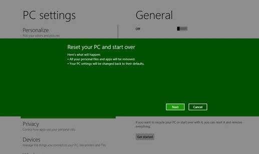
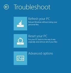
Two cool new features of Windows 8/10 are the refresh and reset options. Reset will remove all your personal data, apps, and settings and reinstall Windows. Refresh will keep all data, apps and settings and reinstall Windows.
If you ever had to do this before in Windows XP or 7, you know what a real pain it is to try and restore Windows without deleting your personal data. And what happens if your PC doesn’t boot at all? Well, you can now refresh or reset from the boot screens.
10. Scaling for Different Screen Sizes
Along with the new UI interface, there have been many improvements in Windows 8/10 for scaling to different screen resolutions, screen sizes and pixel densities.
Even though this may seem minor, you will be able to use Windows 8/10 on everything from a small Windows phone to a giant 34 inch screen with 4K or higher resolution!
A lot of the apps in Windows 8/10 will be designed to automatically adjust to these different screen sizes and provide more/less content based on the size.
Overall, the Windows team has spent a lot of time trying to get things right and Windows 8/10 is a big step forward for PCs (mostly Windows 10). What are your thoughts about Windows 8/10? Do you enjoy using your PC? Let us know in the comments! Enjoy!

