Ubuntu’s been working on its new OS installer for a couple years, now it looks like the upcoming Ubuntu 23.04 ‘Lunar Lobster’ release will finally ship it by default.
The latest pending Ubuntu 23.04 daily builds use the reworked installer by default, and is expected to power the default install experience of the Ubuntu 23.03 beta in March.
Thing is, despite the fact the installer is built using an entirely different toolkit (Flutter) and now leverages the Ubuntu’s server-based Subiquity and Curtin efforts, it doesn’t look that different to the existing one.
In fact, if no-one told you the installer was rebuilt you’d probably never tell.
The new installer was available to test in previous versions of Ubuntu using a special ‘canary’ ISO, and is also available as a Snap app you can run (but shouldn’t) on an existing Ubuntu install.
Now the Flutter-based front-end has filtered out in the official daily builds — so let’s go hands on to see how it performs!
Ubuntu’s New Installer in Action
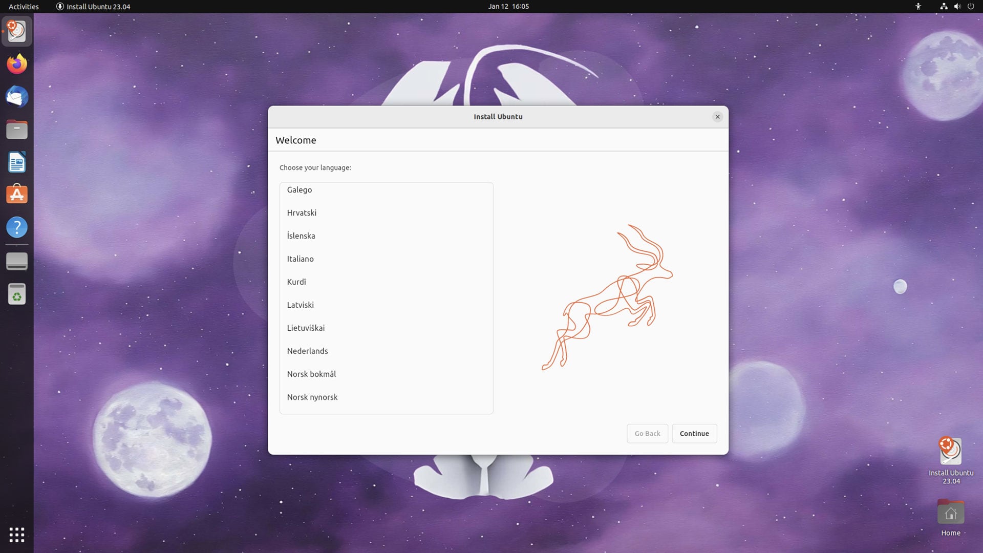
Selecting a language is the first step in the new installer:
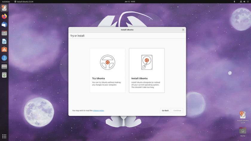
After which, you get presented with the option to try Ubuntu, or to install Ubuntu. There’s a small link to the release notes in the lower-left of the slide:
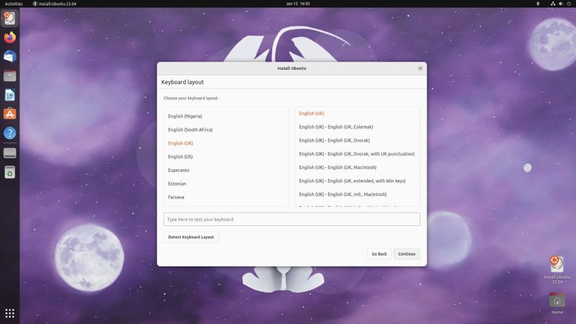
You’re next asked to configure your keyboard layout, exactly the same layout and arrangement of this page as in the existing Ubiquity installer:
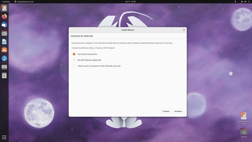
Think things look familiar so far? Well, buckles up cos… the similarity continues! The next page lets you connect to a wireless network (if available), use a wired connection, or avoid connecting to the internet at all (though keep in mind that selecting this may affect choices offered on the next page):
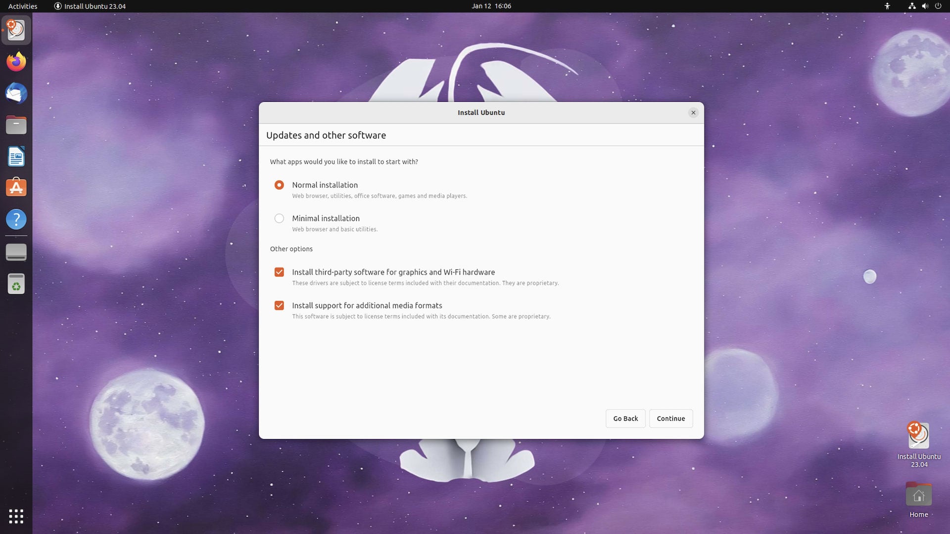
All of the same options present in the Ubiquity installer are present on the next page, including the ‘minimal’ install option introduced back in 2018 to plenty of applause:
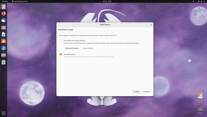
The next two pages concern installation type and location. The “Erase disk and install Ubuntu” is (still) the pre-selected default choice. The “advanced options” opens a modal (not pictured) with options to use LVM and encryption:
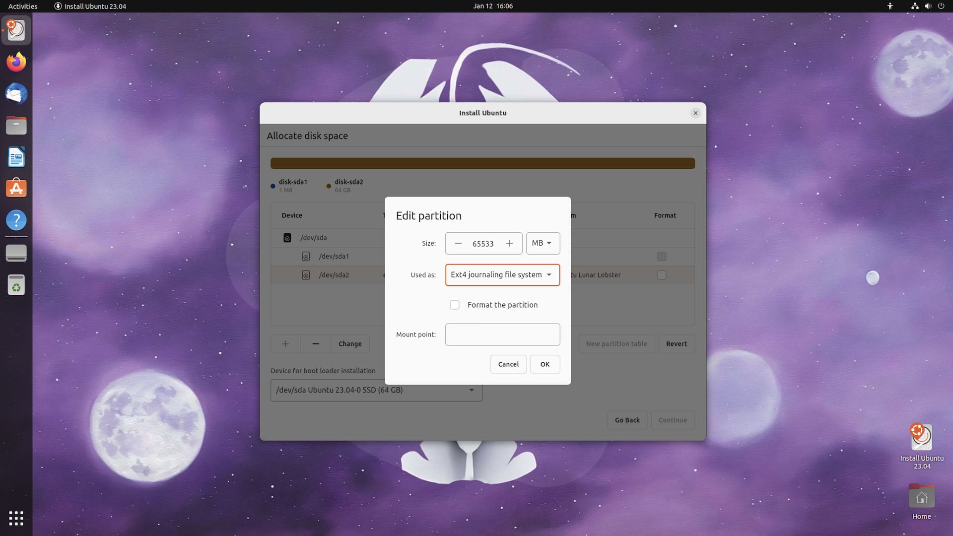
As in the existing installer, selecting “Something Else” opens a partition editor. From here you can manage, partition, resize, and reformat accessible disks, and specify and mount points:
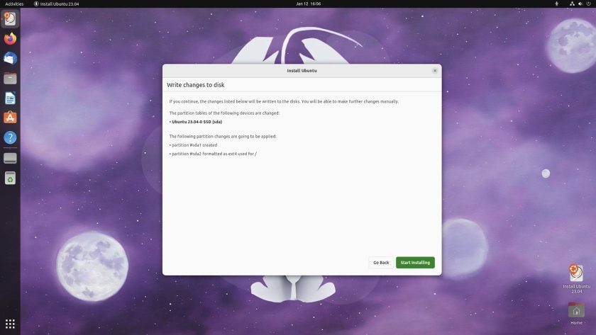
Once done, you see a summary of proposed changes, and a button to —deep breath!— commit n’ continue:
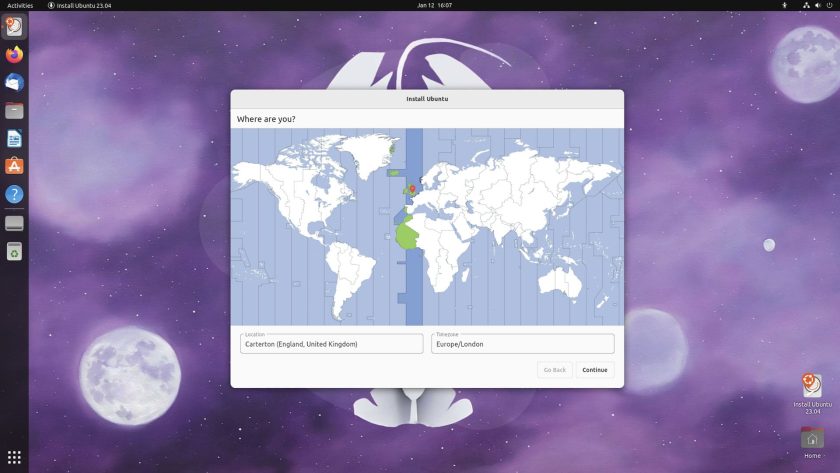
The options here-out are all about configuring the system being primed for install in the background. There’s the super familiar timezone selector screen (which I notice let me select more locations within the UK which I don’t recall the old world map letting me do, it was always London by default):
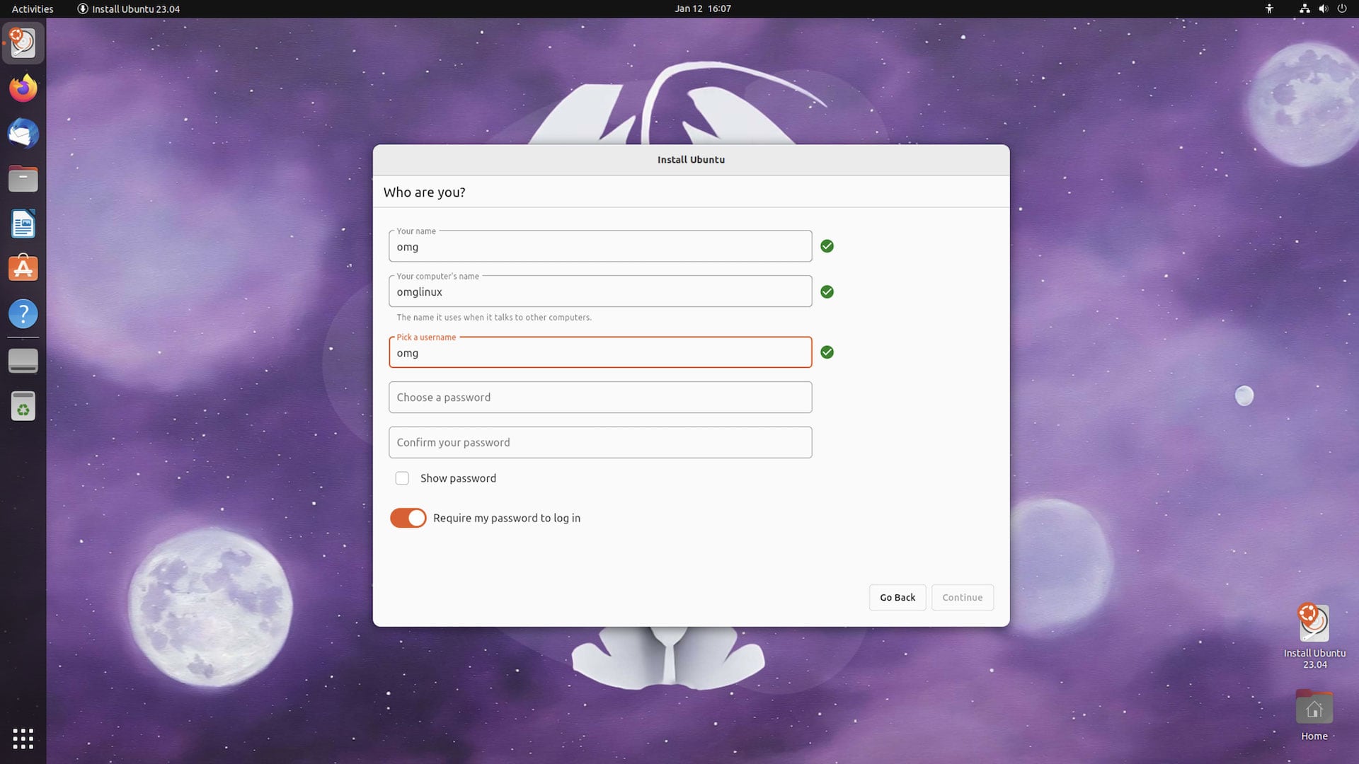
Followed by the exact same user configuration fields for username, root password, and so on:
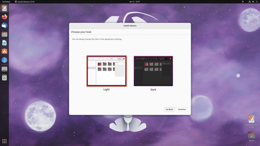
Then, bam: an all-new page. Don’t get excited; it just lets you select between a light or dark appearance (which you can do after installing via the Appearance settings panel. I do wonder if this step would be better integrated in to the Ubuntu Setup app that runs after a fresh install):
Then… the rest is a case of watching a progress bar slideshow of features:
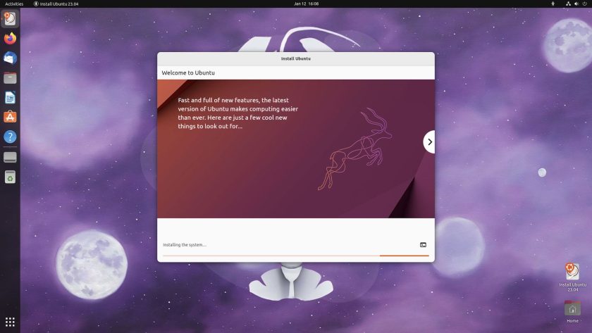
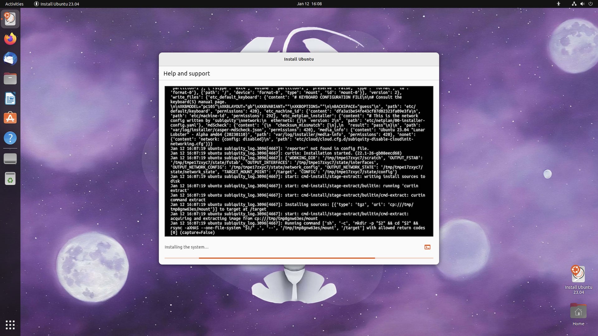
You can, as before, see what’s happening too. I have benchmarks that categorically prove that watching your install complete with the command-line view open makes the installation complete faster 😉:
After that, you’re prompted to reboot and, that’s it!
That’s Ubuntu’s new Flutter install in a nutshell. No major design changes or new options to present in the existing installer — which makes sense: Ubiquity’s design and flow was based on lots of user testing. Ubuntu has one of the easiest, straight-forward installers out there, so as the adage says: don’t fix what’s not broken.
Is there anything you’d change about or like to add Ubuntu’s installer (besides bringing back a ZFS install option)? Let me know what and why down below!


![[How To] Install KDE Plasma 5.8 LTS on Ubuntu [How To] Install KDE Plasma 5.8 LTS on Ubuntu](https://tipsbeginners.com/wp-content/uploads/2022/01/quick-tips.jpg)

