Windows 11 has brought quite a few changes. While the underlying functionality remains identical to Windows 10, the new version of Windows looks and works a bit differently than before.

The biggest focus of the new Windows update is the user interface (UI). Learning from the debacle of Windows 8, Microsoft has worked on simplifying and streamlining the interface, making it easier to navigate than ever before.
Nowhere is this new design philosophy more apparent than in the revamped Windows 11 File Explorer. One of the most used apps for any user, the default Windows file explorer has gone through a complete overhaul. But do the changes improve or detract from the original? Let’s take a look.
Contents
A Brand New Look
The first thing that stands out upon opening the File Explorer is an entirely new look. All the icons have been redone, giving a cleaner, sharper appearance to the whole window.
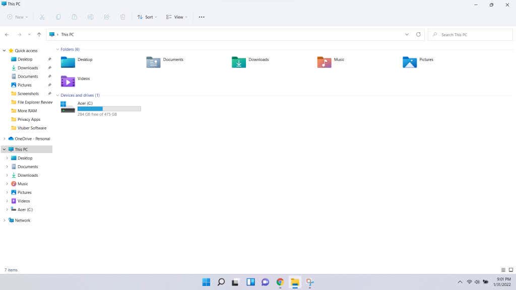
The top ribbon has been dramatically reduced in size and complexity, retaining just a handful of icons rather than a bunch of text in a line. This house cleaning was long overdue and helps in keeping the interface clutter-free.

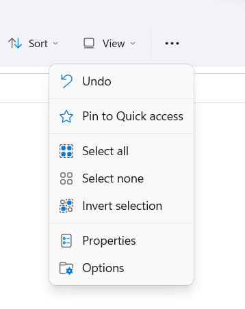
You can, of course, still access the rest of the options by bringing down the three-dot menu.
Dynamic Layout
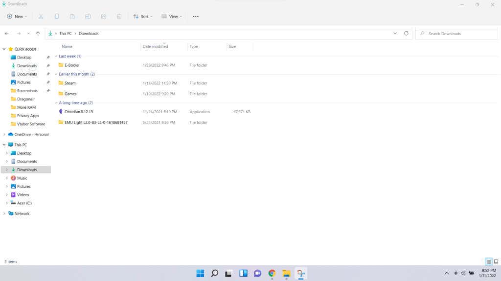
You’ll also notice variable views in different panes. Previously, the default view was Details, and you could select other views from the top ribbon. While it worked, it was irritating to juggle between views for different types of folders.
However, the default layout changes automatically for different types of folders. Opening Downloads, for example, gives you the good old Details view.
But switch over to Pictures, and the layout will change to reflect the visual nature of the folder better.
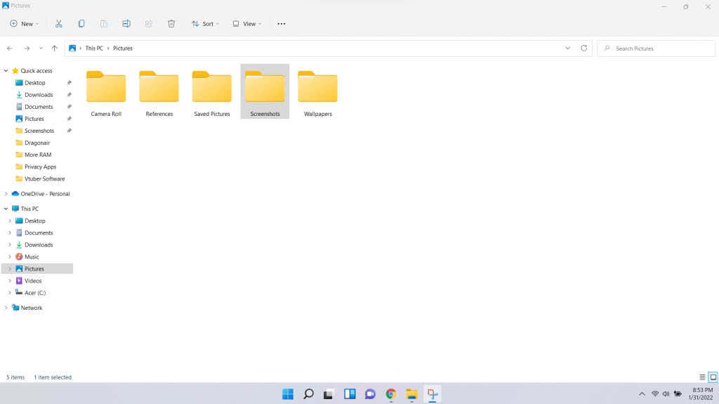
This may not seem like much (since you can still change the views from the top), but it makes the presentation more intuitive by default.
Simplified Context Menu
Another significant change you’ll notice is the reworked context menu. In Windows 10 and before, right-clicking anywhere in the File Explorer sprung a laundry list of options. Now you get a much more streamlined menu, with fewer, more useful options shown.
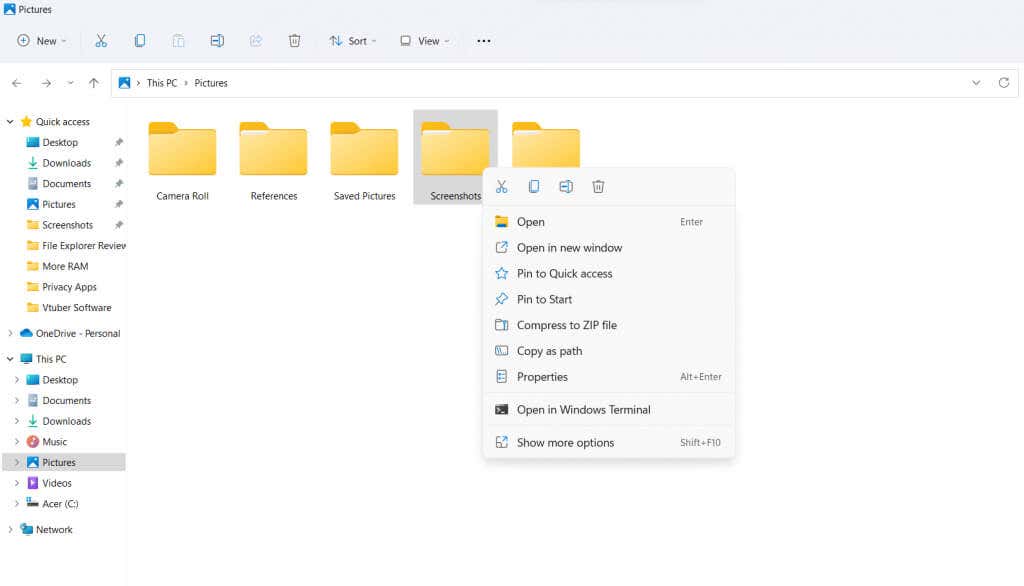
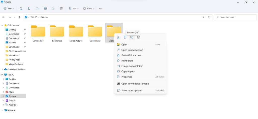
Note the small row of icons at the top of the context menu. Common options like Cut, Copy, Rename, and Delete have been represented as icons to save space and reduce visual clutter. The other options get similar icons, too, making it easier to locate every option at a glance. And for those confused without labels, mousing over an icon reveals its name and keyboard shortcut.
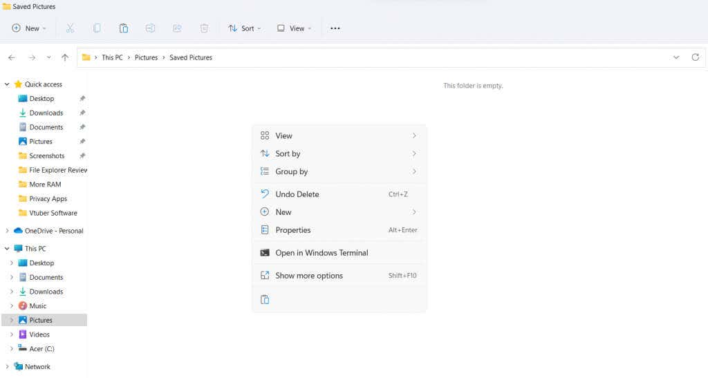
That’s not all. If you copy a file and then right-click over the empty space in any folder, you get a different context menu with the paste option. In the Windows 11 File Explorer, the Paste icon is put nearer to where you clicked, with the context menu itself remaining toward the middle of the screen.
For example, right-clicking near the top side of the screen presents a menu like the image below.
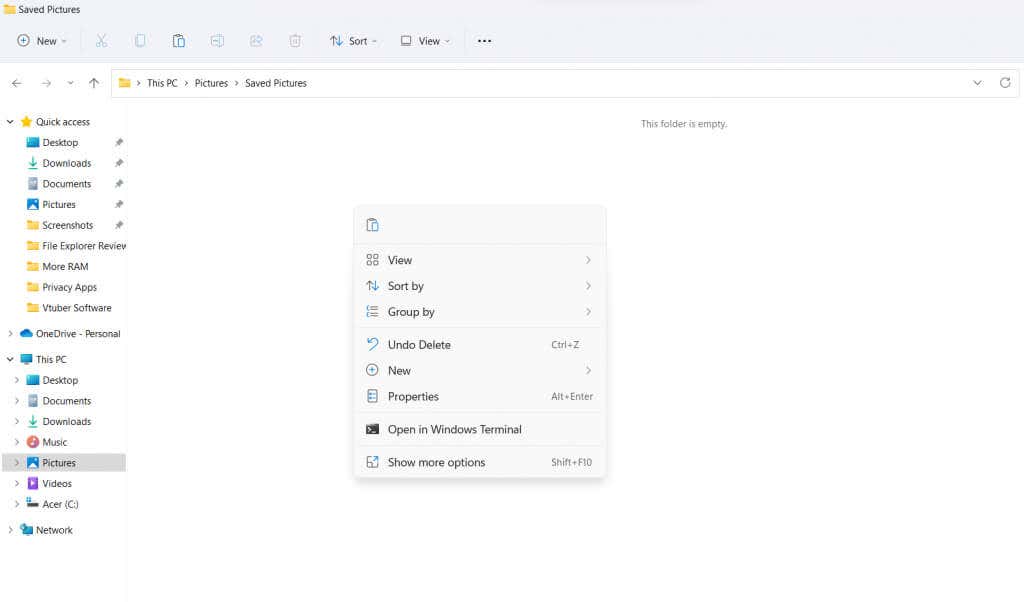
As you can see, the icon for Paste is at the top. But when we right-click toward the bottom side, the icon shifts as well.
Teething Issues
For the most part, the new Windows 11 File Explorer works like a dream. Everything is much more streamlined, making it easier to spot the options you need. But the emphasis on removing text labels and replacing everything with icons can be confusing at first.
The context-sensitive Paste icon, for example, will throw off experienced Windows users by its unexpected location. Many other options have been removed from the menus and can only be accessed by selecting Show more options.
To be honest, however, these are just minor issues that will go away with time. The interface is certainly more intuitive than before, handily managing the growing list of customization options cluttering up the interface.
Is the New Windows 11 File Explorer Worth the Upgrade?
A new version of the Windows operating system rolls out every few years. If things change too much, it is a pain to relearn everything. If it changes too little, there is little reason even to upgrade.
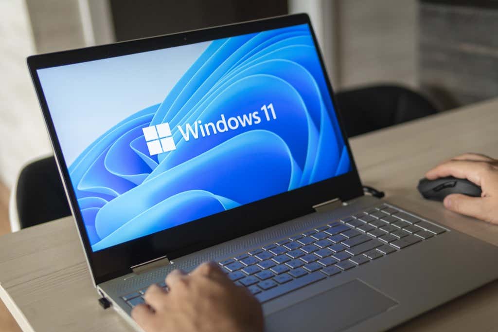
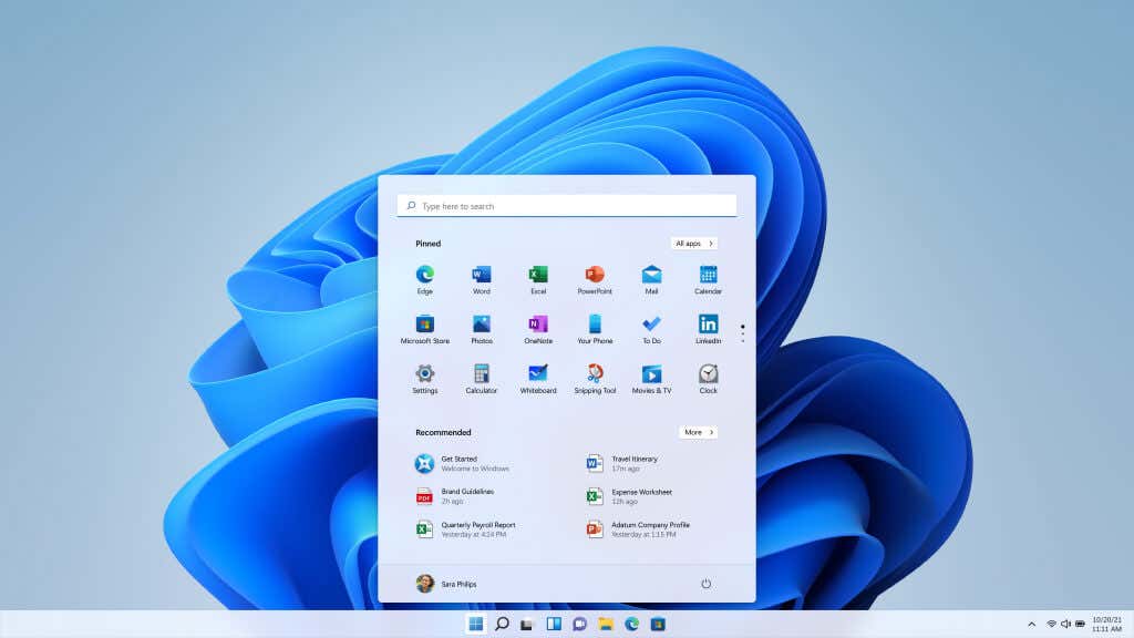
Windows 11 hits a sweet spot. The new features are mostly centered on aesthetics and performance rather than creating a new experience wholesale. From the new Start Menu to the Taskbar, everything looks much better. There are obvious influences from Apple, with the color scheme and rounded corners making it look a lot like Mac, but no one is complaining.
The File Explorer, especially, has come off better. Gone are the cluttered menus tricky to make sense of, in favor of consolidated options. Gone are a bunch of text menu entries, replaced by easier-to-read graphical icons. The new icons are also simpler and cleaner, matching the overall paradigm of keeping things clutter-free.
The essential app has been improved in all the ways that matter and a few that are not readily apparent. Getting used to some of the new changes can be jarring at first, but not a steep challenge. Overall, we would highly recommend upgrading to Windows 11 for the new file explorer, if nothing else.

